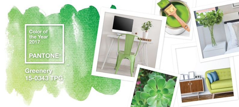
Greenery: Ring in The New Year with Pantone’s Color of the Year
2017 is going to be the year of green. Fashion influencer Pantone has announced the hottest color for 2017.
Greenery.
“Greenery bursts forth in 2017 to provide us with the reassurance we yearn for amid a tumultuous social and political environment,” said Leatrice Eiseman, Director of the Pantone Color Institute. “Satisfying our growing desire to rejuvenate and revitalize, Greenery symbolizes the reconnection we seek with nature, one another and a larger purpose.”
Described by Pantone as “nature’s neutral”, Greenery is an exciting burst of life and energy, yet doesn’t take command all on its own. Greenery is perfect for mixing and matching with different colors in different areas. It allows for unique color combinations, helping other colors take center stage as well as using them to stand out itself.
Greenery symbolizes new beginnings, so what better way to welcome the New Year than to give your home a bright, fresh start with cues from Pantone’s Color of 2017. There are so many ways to do it depending on your style or taste.
During a focus group we conducted with some of Indianapolis’ most influential Realtors, we learned that grey beige is the new white when it comes to popular wall paint choices. Greenery’s subdued color and grey undertones make it an ideal pairing!


Use Greenery as an accent wall surrounded by grey beige. Greytones will serve as the ideal backdrop, enabling Greentones to emerge centerstage. Pantone seems to agree, seeing as that similar grey beige tones are featured in their suggested pairings with Greenery.
Pantone also describes Greenery as “emblematic of the pursuit of personal passions and vitality”. So, why not use it to inject some effervescence in an outdated or tired room?
If you aren’t crazy about the idea of using Greenery as a paint or in a larger amount, it is perfect as a shade to sprinkle and splash around your home. This color makes for perfect throw rugs to help pull the eye to a particular area in the room. You can also use it as throw pillows, picture frames, blankets or curtains to add an extra dimension.
And when it comes to floor pairings, it is hard to go wrong with any choice!
Paired alongside hardwood, Greenery can evoke emotions and sensations of nature’s richness, even in the dead of winter. Use it in a room with a rich hardwood like Inverness Wiltshire Walnut or Gunstock Oak.
Whether it’s a kitchen or bathroom scene you are looking to update, Greenery will be a welcome addition. Dark Light Polished EV06 or Tarvisio Copper Summit contain a darker hue that will allow Greenery to burst through just as it does in nature.
Best of all, you don’t have to imagine how these colors and styles would look in your home. Step one: find a pillow, blanket, paint a wall or even just get a piece of fabric that contains Greenery. Step two: Call Tish Flooring!
Tish brings samples straight to your door so you can see for yourself how these flooring options and more can look in your own space – not just in a showroom. Contact us online or call 317-879-TISH (8474) today to get 2017 off to a fashionable start.