Embrace Nature this Season: Pantone’s 2017 Spring/Summer Fashion Report
It’s hard to believe we are already into spring with summer on its way! Every season Pantone, one of the foremost authorities on all things fashion and color, releases its brand-new fashion report.
Each report is full of the season’s most beautiful and inspiring colors to help guide your fashion choices. It is an awesome guide whether you are thinking about redecorating your home or updating your wardrobe with a couple new outfits.
For the spring and summer of 2017, Pantone drew much of its inspiration from the beauty of the great outdoors. Here’s what Pantone’s spring and summer fashion report has in store for the spring and summer of 2017. We even threw in a few of our own personal recommendations on how best to use them in your home.
A Mixture of Vitality, Relaxation and the Great Outdoors
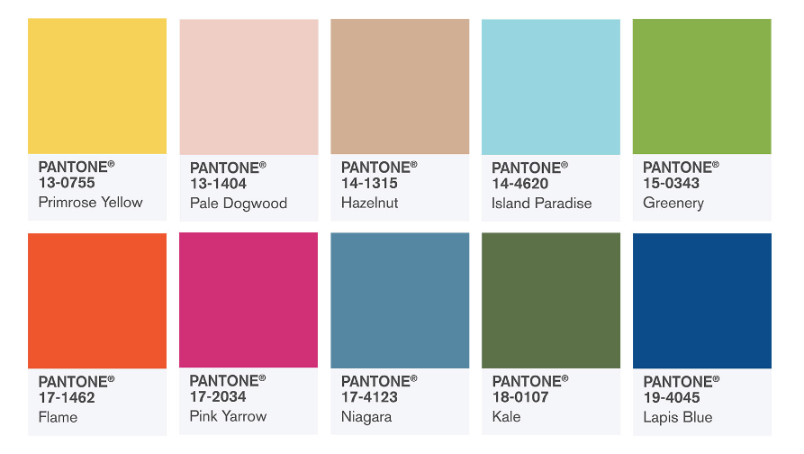
With an array of bright and vivid tones like Flame, Pink Yarrow and Primrose Yellow to stronger and earthier tones like Hazelnut, Kale and Niagara, Pantone’s top 10 are all callbacks to beautiful colors found in nature.
With this new collection, Pantone continues its ode to nature. Their 2017 Color of the Year, Greenery, is included in this collection.
“One of the things that we saw this year, was a renewed sense of imagination in which color was appearing in context that was different than the traditional,” said Leatrice Eiseman, Executive Director of the Pantone Color Institute. “Reminiscent of the hues that surround us in nature, our Spring 2017 Fashion Color Report evokes a spectrum of emotion and feeling. From the warmth of sunny days with PANTONE 13-0755 Primrose Yellow to the invigorating feeling of breathing fresh mountain air with PANTONE 18-0107 Kale and the desire to escape to pristine waters with PANTONE 14-4620 Island Paradise, designers applied color in playful, yet thoughtful and precise combinations to fully capture the promises, hope and transformation that we yearn for each Spring.”
Bring the beauty of outside inside
The 2017 spring/summer fashion report features a wide compliment of colors, so you can easily pick and choose your favorites and how you want to use them.
Shades of green such as Greenery and Kale are the perfect choice for pairing with hardwood or laminate floors. Alongside styles that offer bold, organic character like unique graining, rich color and knots, these colors create authentic and natural scenes perfect for your living room or study.
This is a great set of colors for mixing and matching as well. Shades like Kale, Greenery, Lapis Blue and Flame can be mixed and matched to create a dynamic, “in” look for your kitchen tile. For a little more subdued tile choice, Hazelnut and Pale Dogwood. Both are very calming choices for bathroom tile due to their sandy colors.
Give your colors an emotional connection
However, maybe the more colorful tones like Flame, Pink Yarrow and Primrose Yellow are too eccentric for your tastes? That doesn’t mean they should be left out! Used sparingly and strategically, all three colors make for great accent pieces. Use them as vases, pillows or jewelry. They are bound to give wandering eyes something to focus on and make them say “wow!”
Looking to create a room scene full of serenity and peace? Niagara, Island Paradise and Lapis Blue paired with white or cream-colored carpet can give the desired effect. Use them to cover the entirety of the walls, as an accent wall or use the colors in your décor as pillows or seaglass to achieve the perfect balance.
Need the perfect floors to match the perfect color, but not sure how these styles will look in your home? Tish Flooring brings samples straight to your door! No more guessing how your new floors will look with your new color choices. Call us or contact us online for a free in-home estimate on your schedule. Evenings? Weekends? No problem.


