Celebrate the 2019 Shaw Color of the Year: Whisper
Shaw Floors has deemed 2019 the year of the quiet neutral with the release of its 2019 Color of the Year: “Whisper,” which is actually a pallet of colors rather than a single color.
The Shaw design team said they wanted to back away from gray neutrals to inject some color into spaces while keeping a calming presence. The design team did research talking to consumers across the country to find out which shades resonated the most and these five shades are the result of that research.
Shaw is planning on rolling out a whole line of products in 2019 which match and compliment the shades. The sneak peeks they’ve provided are promising:
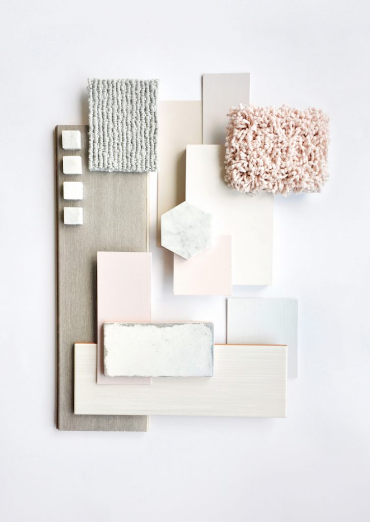
Shaw succeeded in making shades with the intention of calming a space; Whisper isn’t gaudy or boisterous, which is dramatically different from previous year’s Gold Rush and even Sherwin Williams’ color of the year. We’re big fans of a calming color scheme at Tish, but we’re even bigger fans of versatility. Our biggest draw to this color palette is that the colors are easy to integrate into a home’s existing design scheme and may be used together as a palette or just by themselves.
We’re going to break down each color and serve up recommendations for how you can integrate them into your home.
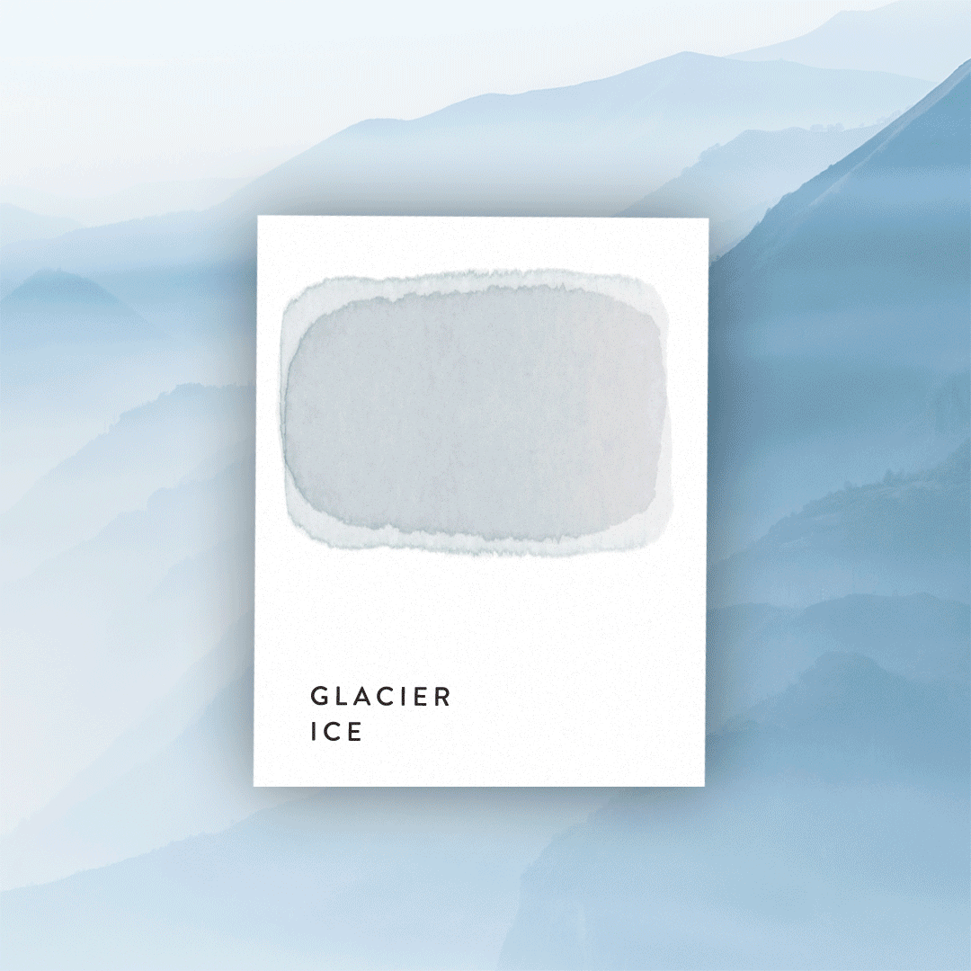
Glacier Ice is a blue that’s barely there and thankfully so. A carpet in this shade can make a subtle statement while allowing light wood furnitures to pop. A bathroom wall in this paint or wall paper shade would keep an otherwise small space from looking too cramped or dark and would also serve to make white tiles stand out.
Despite wanting to move away from the gray neutrals, Mist is certainly a gray neutral. But whereas some grays can be overwhelmingly stark and too much of a statement, Mist is clearly made to allow it’s other friends in the palette to stand out. This shade is perfect for a neutral wood flooring or carpet, but also could be used for kitchen cabinets with the right sandy floors and crisp white countertops.
“Millennial Pink, “Blush,” whatever you decided to call it, this subdued pink shade is the hottest color of the last year with good reason. Pink is a color often associated with girlhood and eccentricity but by numbing it in the way Shaw has here it had been give sophistication. Often used as a shade for furniture, it pairs well with light or medium shade hardwood floors.
Clay is the only earthy tone in the palette and it sneaks in by masquerading as a cool tone. It makes a perfect hardwood flooring color and was undoubtedly chosen to be used as such with the other colors in the palette. If all these calm neutrals aren’t your thing, a hardwood flooring in this shade would go well with a navy wallpaper in a living room or study.
Purple is making a comeback in the same way pink is: by diluting it to give it some maturity. Shades like Dusty Lilac are making big moves as statement colors. It’s been used as not only furniture colors but also kitchen cabinet colors and as a home exterior color. Dusty Lilac will go well with white and gray tiles if you were trying to use it to brighten bathroom walls. However, when picking a bathroom tile, choose something simple like a subway tile so as to let the Dusty lilac be the real statement.
What do you think about Shaw’s Color(s) of the year? Is it something you’ll use in your own home? Let us know!